Screen Customization allows for the customization of form input field headings and masks, custom field creation and assignment as well as attachment set-up on initiative and option pages. This is managed by Administrators only.
A pre-requisite of screen variant configuration is that required Attachment Types have been maintained under Configuration Data.
Theme
The theming configuration provides the administrator with the ability to alter the logo and theme of the group Stratex environment.
Logo: The default logo that represents the given company can be uploaded into the ‘value’ section of the logo row. This can be done through the upload button and sets out the colors to be used in the below areas.
Topbar Background Color: The background color of the topbar should contrast the highlight background color so that the buttons are easily visible and is often a more neutral color as it is the most prominent topbar theme.
Topbar Text Color: This is the color on all text in the topbar excluding the buttons. Most of the time this is set to white for readability (or black)
Highlight Background Color: This section of theming impacts the background color of the buttons for Ideas, Proposals and Business Cases, as well as other buttons and the underline of the topbar.
Highlight Text Color: This sets the color of text that is in buttons such as Ideas, Proposals, Business Cases, and profile.
There is an inclusion where reverting to default is always possible
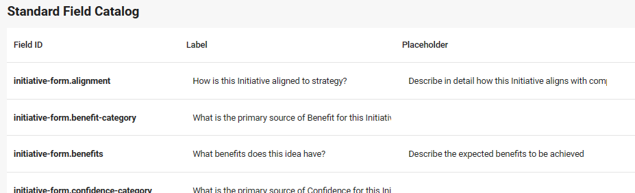
Standard Field Catalog
The Standard Field Catalog gives the administrator the ability to re-name most input field labels and place holders.
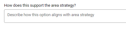
In this example, ‘How does this support the area strategy?’ would be the Label and ‘Describe how this option aligns with area strategy’ would be the place holder.
Stratex Also offers the ability to configure a minimum and maximum number of characters for each field for admin users. This feature could be useful for SAP integration or ensuring detailed responses to particular fields by standard users.
Admins can make certain standard fields required or optional by selecting the option in the dropdown next to the field.
Field ID | Location |
|---|---|
glossary.cost-centers | Configuration Data > Companies > More |
glossary.plants | Configuration Data > Companies > More |
glossary.plant | PDF (Prinit Initiative) and Org. Structure & Budget |
glossary.cost-center | PDF (Prinit Initiative) and Org. Structure & Budget |
glossary.cost-center(s) | Workflow > Agents, Authorisation Group |
glossary.plant(s) | Workflow > Agents, Authorisation Group |
Custom Field Catalog
The Custom Field Catalog is where the different Custom Fields are defined. This means that it is here that the Administrator will create the custom fields, but they then need to be configured for use under Screen Variants below.
Depending on the purpose for which the custom field is to be used, the configuration is very important otherwise it will not render as desired for the user.
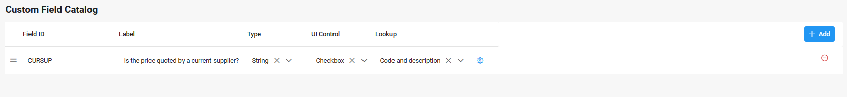
Field ID - This is the system code and will not appear anywhere for the user but must be entered and be unique for this functionality to work.
Label - This corresponds to what will be rendered when the custom field is rendered for the user and describe the purpose of the custom field.
Type - TAs the name implies; the type will determine the behavior of the field.
String - A sequence of characters
Integer - A whole number (No fractions)
Decimal - A number with decimal point
Date - Renders a date selection for the user
Date & Time - Renders a date selection for the user
Boolean - Renders the ability to select the description or not.
Currency - The field will render with two sections. When the user selects the currency, it will automatically render a currency symbol in the input box where the amount is entered.
UI Control
Input - Will accept any characters entered
Select - Will render a drop-down list of options configured to select from
Checkbox - Will render as check boxes for selection
Radio - Will render as round selection options
Textarea - Will render as a text box without rich text editing
Rich Text Editor - Will render a text box with rich text editing
Date-Month - Will render a date selection pop-up. This selection will be limited to Month and Year selection.
Date-Day - Will render a date selection pop-up. This selection will allow users to select the Day, Month and Year.
For a custom field to have a date in the format of YYYY-MM-DD please ensure the type of the custom field is Date & Time and with a UI control of Date-Day.
Lookup - This pop-up will only appear for the Administrator configuring the custom field under certain Type / Lookup combinations and if Code and description is selected under lookup. If all of this is done then the following pop-up will appear when the blue gear is selected next to the custom field being configured.
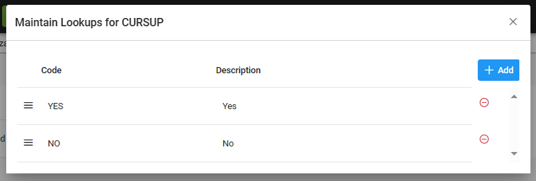
Code - This is the system code and will not appear anywhere for the user but must be configured.
Description - This corresponds to what will be rendered when the custom field is rendered for the user and will give the options to select.
Custom fields created here may be displayed as columns in the Initiative Analytics tab and can be selected from the Additional Information section, provided they have been used in a screen variant.
Reporting of dates are localised. i.e for en-AU the date format is dd/mm/yyyy and for en-US the date format is mm/dd/yyyy.
Screen Variants
Once the Admin is satisfied they have created all the required custom fields in the Custom Field Catalog, the next process is to group them into Screen Variants. The final step is to then link Screen Variants into the workflow via Initiative Classification in Configuration. Any number of screen variants can be created and linked as described above.
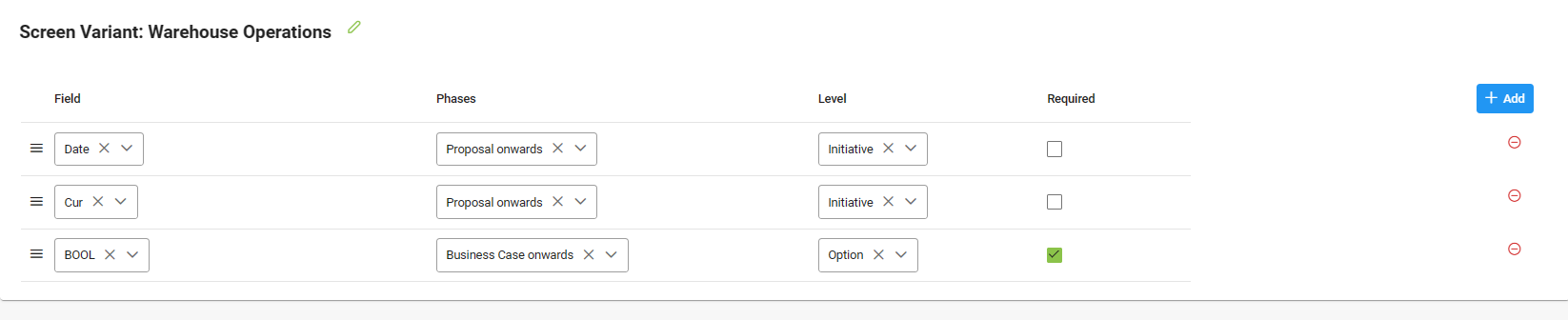
Field - Select the field to be used from the drop-down list.
Phases - Select when the field is to first start appearing. This can be either idea, proposal or business case.
Level - Select the level at which the field is to appear. This can either be initiative or option.
Required - If selected then the field completion is mandatory, if not then it is optional.
Attachment Variants
The attachment screen variant allows the administrator to define when Attachment Icon are to appear at specific places on an Initiative. It also allows for the configuration of what Attachments Types can be added behind the Attachment Icon. Additionally, these attachments can be set as optional and/or mandatory and can be configured for each stage (Idea, Proposal, Business Case, Project).
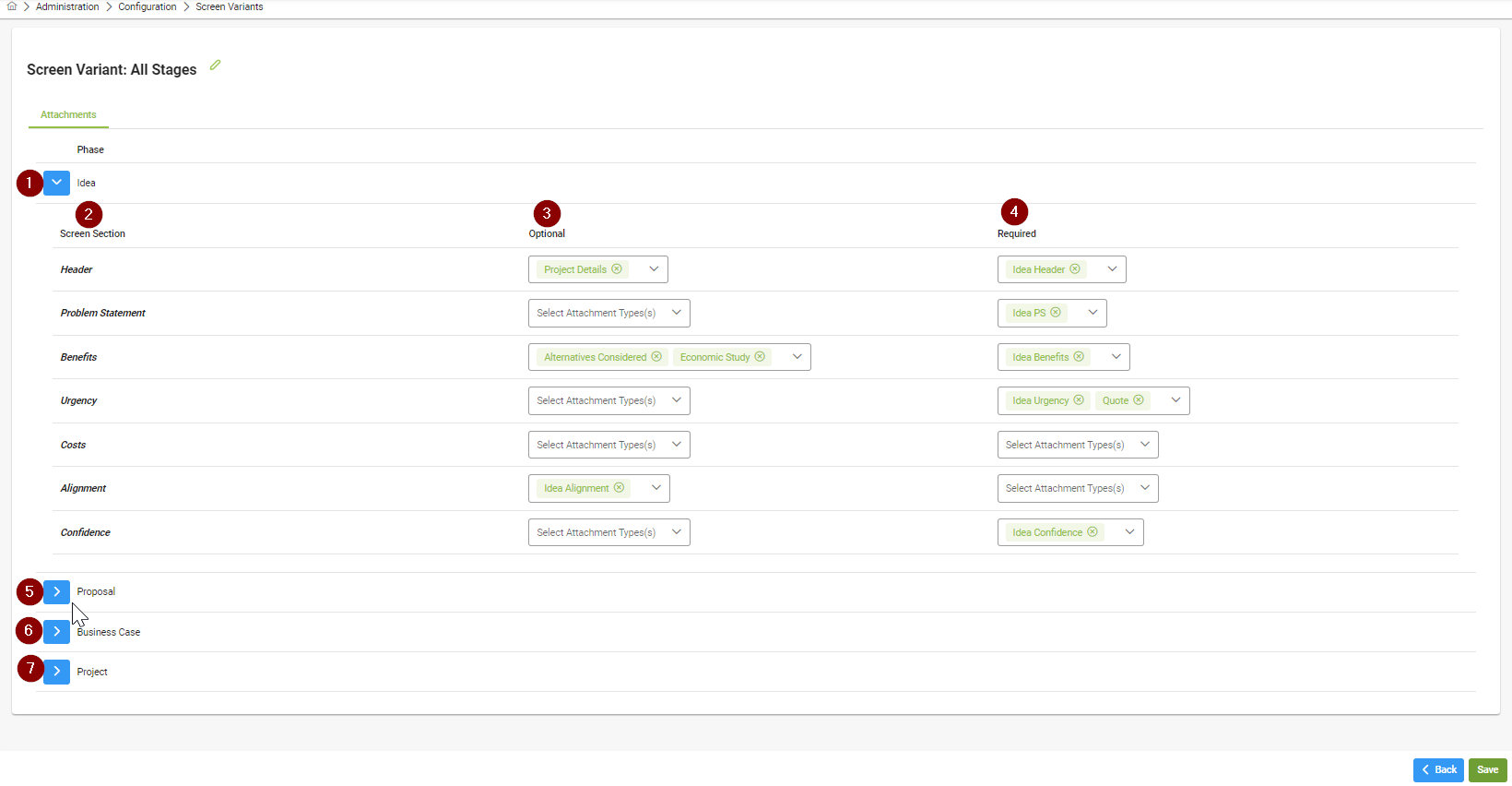
Idea dropdown - click on the dropdown to configure the Idea stage
Screen Section - This corresponds to the section of the initiative screen that the attachments will appear at. For each screen section there can be no attachment, an optional attachment(s) or a mandatory attachment(s)
Optional - To add one or more optional attachments for a screen section, go to the Optional drop down box in the same row as the screen section to be configured, one or more attachment types displayed. Click the attachment type again to deselect it.
Mandatory - To add one or more mandatory attachments for a screen section, go to the mandatory drop down box in the same row as the screen section to be configured, one or more attachment types displayed. Click the attachment type again to deselect it.
Proposal dropdown - click on the dropdown to similarly configure the Proposal stage
Business Case dropdown - click on the dropdown to similarly configure the Business Case stage
Project dropdown - click on the dropdown to similarly configure the Project stage